Putting Data Privacy and Security into the hands of Consumers
UX/UI DESIGN
Protekt is a privacy assistant IOS app that encourages young adults to simply and conveniently adopt safer online habits. It allows users to find and manage all of their accounts they have created online, helping them improve their online presence and digital security.
Mockup of Protekt App Screens
Project OVERVIEW
The Kick-Off
Project Type:
Timeline:
Role:
Tools:
Academic Feb-May 2021
8 Weeks
UX Researcher, Design Strategy, UX/UI Designer
Icon: Figma LogoIcon: Adobe XD LogoIcon: Photoshop LogoIcon: Illustrator Logo
From Feb 2021-May 2021, I completed a full-time UX Design Bootcamp with BrainStation to obtain a Diploma in UX Design. During the Bootcamp, I was tasked with completing an 8-week capstone project to create a compelling and practical digital experience. This experience was an end-to-end UX design process that took me from idea generation and research to developing a mobile app interface and brand.
VIEW PROTOTYPE

My Approach to the Challenge

When approaching this design challenge, I leveraged design thinking methodology to ensure my focus throughout the process was on the people I was designing and creating for. I wanted my project to be economically viable and technologically feasible, but most importantly, I needed it to be desirable and address real human needs.
Icon: Heart with Person Inside
Empathize
Secondary Research
Primary Research
Problem Space
Icon: Pencil
DEFINE
Personas
Experience Map
Opportunity Selection
Icon: Lightbulb
IDEATE
User Stories
Task Flow
Icon: Phone Screen Prototypes
PROTOTYPE
Low-Fi Wireframes
Mid-Fi Wireframes
Icon: Test Paper
TEST
Usability Testing
Incorporating Feedback
Hi-Fi Wireframes
Icon: Glasses
REFINE
Visual Identity
Hi-Fi Prototype
Human-centered design process

EMPATHIZE

Discovery of problem space
Dipping my Toes in Digital Privacy
As a young adult and a classified digital native, I had never put much thought into digital privacy until asked to create a design that solves human problems. While digital privacy and security is something that my peers and I have always brushed off, I believe that it will be a key driver that reshapes the digital landscape within the next 5-10 years. This inspired me to look deeper into how digital privacy is impacting our lives and what we can do about it.
SECONDARY RESEARCH
Digging Deeper into the Problem
Canadians' concerns for their digital security and privacy are growing exponentially. With the transition to more work-from-home lifestyles, Canadians have been increasingly dependent on the digital world, which has led to an unprecedented amount of attacks on their data security and privacy.
92%
of Canadians expressed some level of concern about the protection of their privacy.
Office of the Privacy Commissioner of Canada, 2019
And who are most vulnerable? While Gen Z's are the most tech-savvy, they are also the most willing to trade their personal information for convenient and personalized experiences. However, when it comes to protecting their data, the effort and complexity required to maintain safer online habits are significant barriers for Gen Z's.
54%
of Canadians Gen Z’s say it takes too much time to manage their data across every app and service.
Help Net Security, 2021
Before Gen Z's start to enter into the "real-world" where the threats of sharing personal information online hold much more gravity, it is crucial for them to develop safer online habits.

DESIGN CHALLENGE:

How might we help Gen Z’s who share personal information online, learn and execute safer online habits in order to reduce the risk of their personal information being misused?
PRIMARY RESEARCH
Understanding the User
To understand the “why” behind the problem, I conducted five 30-minute interviews with Canadians between the ages of 18-24 who share their personal information online. I wanted to understand their attitudes and feelings towards digital privacy and explore how they currently manage their online information.

After completing the interviews, I combed through the interview notes, classified quotes as pain points, motivations, or behaviours, and used empathy mapping to extract six main themes and insights:
Icon: Person pushing bolt up hill
EFFORT
Individuals demand simple and easy experiences
Managing digital privacy is far too complicated, laborious, and boring.
Icon: Book with a brain above
KNOWLEDGE
Individuals want to know “what” and “how”, but the information is not accessible
A lack of easy access to digital privacy information has led to a major gap in knowledge about personal information collection, usage, threats, and protection.
Icon: Confused Person
CONCERN
Perceived online vulnerability correlates to stage in life
Given Gen Z’s “early” stage of life, these individuals do not feel that their personal information is at risk, creating a low level of concern.
Icon: Speakerphone with noise coming out
AWARENESS
Increased awareness leads to a higher willingness to learn
Increased awareness of the risks and threats of sharing information online encourages individuals to learn how to engage in safer online habits.
Icon: An ear inside a no/cancel sign
ignorance
Ignorance is bliss
When it comes to digital privacy and information usage, individuals would rather not know what they don’t know.
Icon: A person's mind
mindset
Approach privacy with a reactive mindset
Due to lack of awareness and concern, individuals tend to use a reactive vs. proactive approach when dealing with their digital privacy.
Icon: Person pushing bolt up hill

KEY INSIGHT: EFFORT

While increased education/knowledge and significant concern may encourage individuals to engage in safer online habits, the most significant barrier preventing these individuals from managing their digital privacy and engaging in safer online habits is the effort required to do so.

Due to the boring nature of digital privacy and the complicated ways companies communicate privacy, it is more convenient for individuals to ignore safe online habits. If engaging in safer online habits was simple, digestible, and user-friendly, these individuals would do it.

DEFINE

PERSONA & EXPERIENCE MAP
Uncovering the Moment of Opportunity
After synthesizing my interviews into insights and pulling out a key insight to focus on, I developed a persona and experience map to ensure my design process was driven by my target user’s goals and behaviours. These artifacts helped me:
1
Build empathy for the user by exploring their goals, frustrations, and behaviours.
Icon: Vertical Line
2
Identify opportunities to intervene with my digital solution.
Icon: Vertical Line
3
Create an optimal user experience that achieves the user’s goals.
My primary persona, Katie Robertson, is a 23-year-old young adult who constantly shares information online and values her digital privacy and security but needs an effortless and convenient way to engage in safer online habits.
Primary Persona: Katie Robertson
Using Katie, I developed an experience map to understand her end-to-end experience for sharing information online. By putting myself in the users shoes, I was able to identify moments of opportunity where I could intervene with my digital solution.
Experience Map for Katie Robertson
Having a deeper understanding of my persona, her main pain points, and the areas of opportunity highlighted in the experience map, it was important to revisit my "How Might We" statement and make any necessary revisions to ensure that it still best framed the problem at hand:

REVISED DESIGN CHALLENGE:

How might we make engaging in safer online habits as simple and easy as possible for Gen Z’s (aged 18-24) who share personal information online in order to reduce the risk of their personal information being misused?

IDEATE

USER STORIEs & TASK FLOWS
Creating Safer Account Management Habits
In order to begin brainstorming the functionality and features of my solution, I created several user stories under different epics and initiatives that followed the structure:
“As a user I want to action so that I benefit.”
Given that my problem space was so expansive, I looked back at my primary and secondary research to see where the biggest opportunity was in order to identify an initial focus. My findings showed that Gen Z’s feel that managing data across all accounts is too laborious and complicated, so I narrowed in on developing user stories within the initiative, Safer Account Habits.
Diagram narrowing down to Safer Account Habits Initiative
Chart: Narrowing down a specific initiative
PRIMARY TAsK:
A crucial first step to creating safer account habits is a users awareness of all of their online accounts. Using multiple user stories from the epic "Account Awareness”, I created a primary task flow of: creating an overview of companies the user has registered accounts with.
“As a young adult sharing personal information online, I want to view a comprehensive list of all my online accounts so that I can be aware of all my accounts online that could be collecting my data”
“As a young adult sharing personal information online, I want to find accounts by email address so that I can minimize time spent finding my online accounts”
*For the case study, I highlighted the two user stories that best represented my products value proposition in the primary task flow.
SECONDARY TASK:
As the user achieves the primary task flow of creating an overview of companies they have registered accounts with, the user gains awareness of the true scale of their online profile. As a secondary task, users need to be able to manage and delete accounts to clean their online profile. Using multiple stories from the epic, “Account Controls”, I created a secondary task flow of: cleaning online profile by deleting unnecessary accounts.
“As a young adult sharing personal information online, I want to delete accounts associated with a specific email so that I can save time deleting accounts that have a compromised email”
“As a young adult sharing personal information online, I want to delete accounts by date last used so that I can minimize my effort spent deleting unnecessary accounts”
*For the case study, I highlighted the two user stories that best represented my products value proposition in the secondary task flow.

PROTOTYPE

SKETCHES & WIREFRAMES
Exploring Solutions
Once I was clear on my primary and secondary task flows, I used paper and pen to sketch out possible solutions. Drawing inspiration from other existing UI components on Dribbble and looking at features from competitor apps like Jumbo, SAFE Me, and MyPermissions, I started sketching out different ideas. Below are my top sketches that were translated to wireframes.

App Idea: An IOS app that acts as a privacy assistant, making it simple and easy for Gen Z’s who share information online to recognize and develop safer online habits.
Sketch #1: Empty Account Summary Page
Sketch #2: Account Scanning Page
Sketch #3: Populated Account Summary Page
Sketch #4: Your Online Accounts Page
Sketch #5: Account Deletion Page
Sketches that were translated to wireframes
From the series of sketches I developed, I highlighted different ideas, features, and components to incorporate into the first round of low-mid-fidelity grayscale prototypes. Developing and working with grayscale prototypes allowed me to quickly iterate and test out components, layouts, information hierarchy, and screen flows before adding a visual identity.
Wireframe #1: Account Deletion Confirmation Page
Wireframe #2: Empty Account Summary Page
Wireframe #3: Find Your Accounts PageWireframe #4: Finding Accounts PageWireframe #4: Populated Accounts Summary PageWireframe #6: Your Online Accounts PageWireframe #7: Account Deletion Popup Modal
Version 1 of grayscale wireframes

TEST

USABILITY TESTS (TWO ROUNDS)
Gathering Feedback
During the wireframing process, I conducted two rounds of usability tests on ten different individuals to obtain practical, real-time feedback that was incorporated to improve the design and deliver a more frictionless user experience. The testers were asked to complete a set of five tasks while navigating through the prototype, which will helped me observe how real users interacted with the app and see if the app’s functions and features helped the user achieve their goals.
Major Change #1: Accounts Homepage
Opening up the app to this page, testers were not immediately clear that this was an accounts summary page due to an unclear page header, illustration, and copy.
Rephrased “Account Summary” to “Online Accounts Summary” to be more indicative that this is the accounts summary page.
Reduced size of icons and text in bottom navigation as  they were too large on mobile view. Added hotspots for easier navigation.
Wireframe Account Summary Page Version 1
Version 1
Wireframe Account Summary Page Version 2
Version 2
Wireframe Account Summary Page Version 3
Version 3
Updated illustration and descriptive copy to better represents the task flow.
Major Change #2: Online Accounts Summary Page
The accounts summary page was confusing to users for many reasons: 1) testers didn’t understand what the pie chart graphic was trying to communicate, 2) the call-to-actions were not clear or bold enough, and 3) testers weren’t sure who or what the recommendations were for.
Updated pie chart design and added additional visual signals to show the functionality.
Added descriptive copy to highlight what the recommendations are and updated fidelity by adding illustrations and copy.
Wireframe Populated Account Summary Page Version 1
Version 1
Wireframe Populated Account Summary Page Version 2
Version 2
Wireframe Populated Account Summary Page Version 3
Version 3
Changed positioning of both call-to-actions, drew more attention to “View” call-to-action, and rephrased “Find More Accounts” call-to-action.
Major Change #3: Your Online Accounts Page
On the online accounts page, testers felt a lack of control as they weren’t easily able to identify the filter function and were unable to sort accounts. Testers were also worried about accidentally deleting important accounts when swiping to delete and feared that it could get laborious when deleting multiple accounts.
Updated filter icon and placement to make it more obvious to users.
Changed method of deleting an account from swipe to delete to select to delete.
Wireframe Your Online Accounts Page Version 1
Version 1
Wireframe Your Online Accounts Page Version 2
Version 2
Wireframe Your Online Accounts Page Version 3
Version 3
Added sort by functionality.
After incorporating all of the feedback from the user testing and resolving the most pressing usability issues, I landed on my final grayscale prototype, prototype version III.
Wireframe #1: Account Deletion Confirmation Page
Wireframe #2: Empty Account Summary Page
Wireframe #3: Find Your Accounts PageWireframe #4: Finding Accounts PageWireframe #4: Populated Accounts Summary PageWireframe #6: Your Online Accounts PageWireframe #7: Account Deletion Popup Modal
Version 3 (Final Version) of grayscale wireframes

REFINE

VISUAL IDENTITY: JOURNEY TO HI-FIDELITY
Gathering Feedback
After completing user testing, I enhanced the user experience by translating my grayscale prototype into a high-fidelity prototype by developing and applying a visual identity to my digital product.

To establish my products’ brand, I began writing a list of keywords that embody the brand’s essence and define the personality of the product.
Icon: Shaking Hands
Secure
Trust
Protected
Icon: Superhero
Empowered
Confidence
Freedom
Icon: Two people high fiving
Clarity
Simple
FRIENDLY
Using these keywords, I searched for inspiration and created a mood board, colour palette, and typography system that evoked a simple, modern, innovative, and trustworthy feeling.
Moodboard
Primary Colours
Primary Colours
#1821CC
#FFFFFF
Secondary colours
Secondary Colours
#1ED9C6
#010D55
#1821CC-
#1ED9C6
TERTIARY COLOURS
Tertiary Colours
#1E69D9
#49D4AA
#FD7983
#D94042
FUNCTIONAL COLOURS
Functional Colours
#404980
#878CA8
#B8BBCC
#E9F0FB
#F7FAFF
LOGO TYPEFACE
Sofia Pro TypefaceSofia Pro Typeface Alphabet
PRIMARY TYPEFACE
Visuelt Pro TypefaceVisuelt Pro Typeface Alphabet
Protekt’s Visual Identity
Word mark Exploration
When exploring an app name and icon, I wanted to create something unique and memorable to encourage easier word-of-mouth. Using concepts and words surrounding security, trust, protection, and care, I generated a list of potential brand names to test on users: Profil, Tuitio, Introl, Cura, and Protekt. Protekt resonated the best with users, evoking a modern and “tech-y” feel while also signifying the purpose of the app. After numerous iterations, I landed on the final word mark you see below.

To create a distinct word mark, I replaced the letter “o” with a gradient fingerprint and modified the letter “t” to create a seamless flow between letters. The fingerprint acts as a unique icon, responsive word mark and embodies the idea of a digital identity.
Protekt primary word mark
Primary Word mark
Protekt app/social icon
App/Social Icon
Protekt reverse mono word mark
Reverse Mono Word mark
Protekt gradient word mark
Gradient Mono Word mark
Protekt B&W mono word mark
Reverse B&W Mono Word mark
High-fidelity prototype
Enhancing the User Experience
Injecting my brand’s visual identity into my prototype was a challenge that I didn’t anticipate. Properly balancing out the colour ratios, establishing a type hierarchy that works on mobile and is accessible, and designing a unique identity required many tries and rounds of testing.

After countless hours using the Figma mirror app, screen recording, and getting feedback, I created my final UI prototype and developed an accompanying UI library that uses Brad’s Frost Atomic design system.
App Mockup in iPhone
Final Interactive Prototype
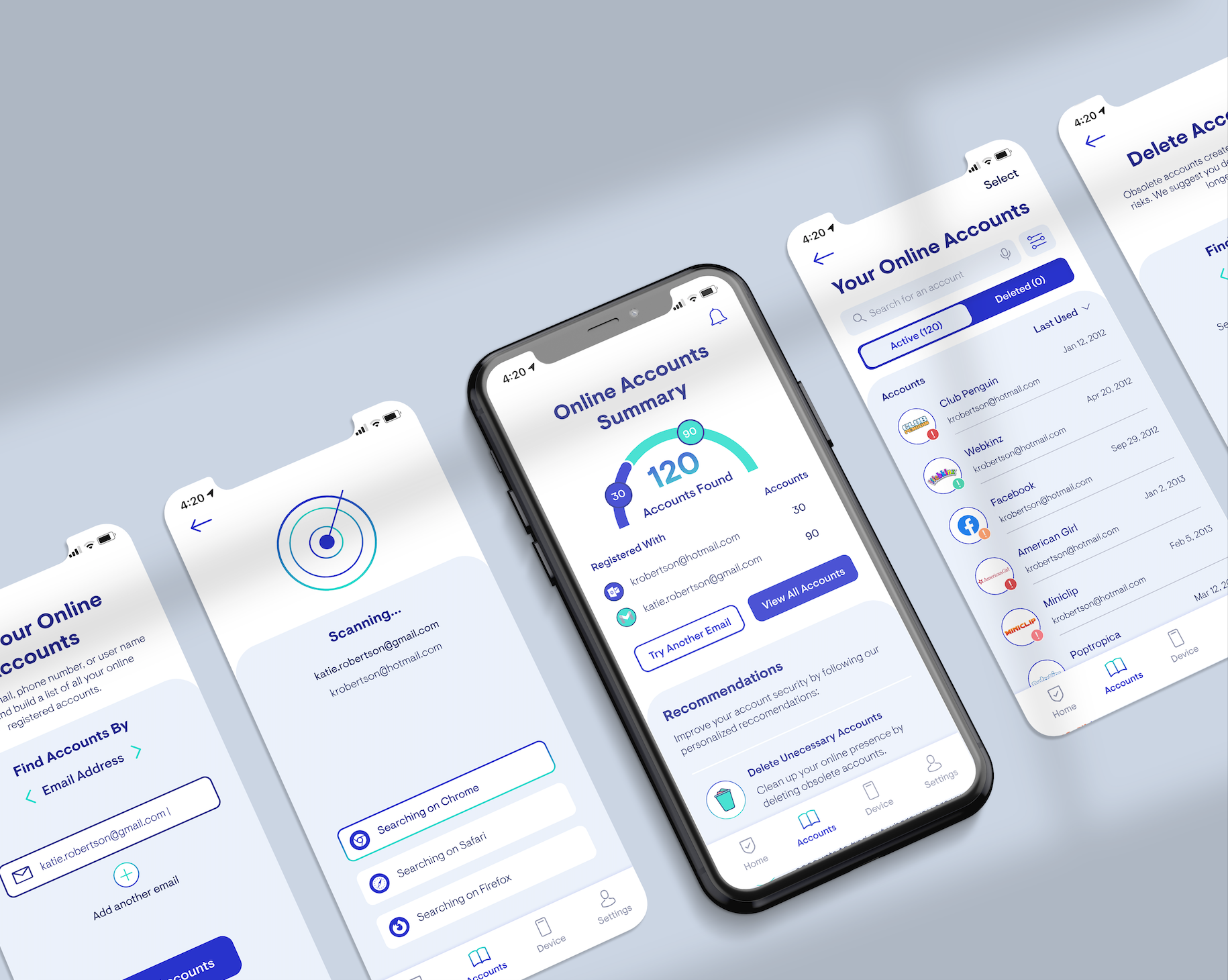
Looking at the high-fidelity prototype, we can see the three main benefits that Protekt offers:
Feature 1: Finding online accounts.
Hi Fi Mockup: Empty Accounts Summary Page
Hi Fi Mockup: Find your Online Accounts Page
Hi Fi Mockup: Searching for Accounts Page
When interviewing users, a key pain point raised was that they had no idea about the true scale of their online profile and had no easy way to find out. With Protekt, users can easily and quickly find all of their online accounts connected to a specific email, username, or phone number to build a comprehensive understanding of their online profile.
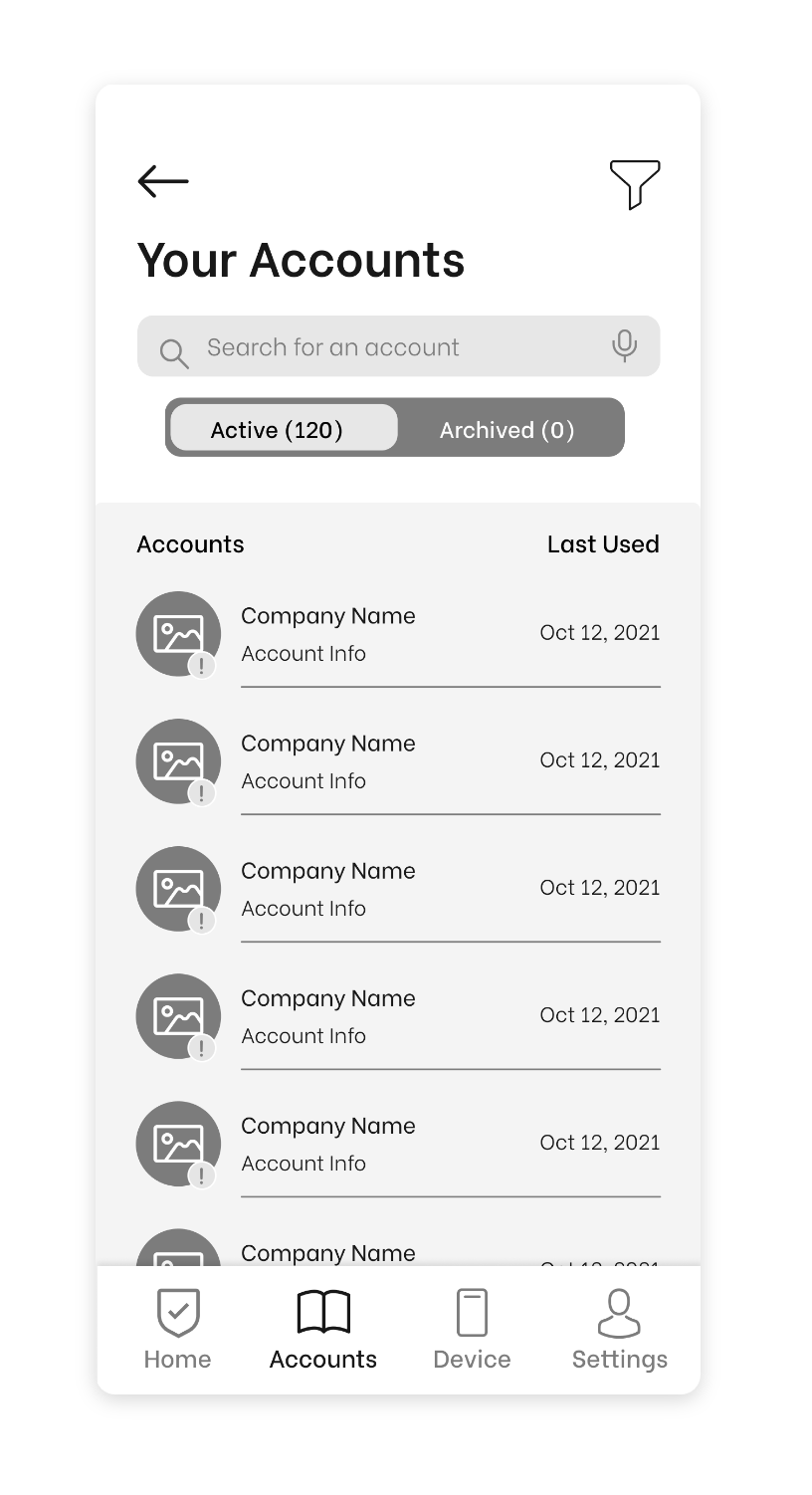
Feature 2: Viewing & managing online accounts.
Hi Fi Mockup: Populated Accounts Summary Page
Hi Fi Mockup: Your Online Accounts Page
Hi Fi Mockup: Delete Account Confirmation Popup Modal
Interviewees indicated they were in the dark about managing their online accounts and data. Protekt makes managing accounts easier by providing users with a summary of accounts, useful filtering and sorting options, and allows them to control their data by deleting accounts and requesting data removal in-app.
Feature 3: Recommendations to improve account security.
Hi Fi Mockup: Populated Accounts Summary Page- Recommendations section
Hi Fi Mockup: Recommendation Delete accounts Page
Hi Fi Mockup: Accounts Deleted Confirmation Page
Another key finding from my interviews is that convenience is king. Users want a solution that doesn’t require them to change their current behaviours or add any steps to their online routine. By providing users with recommendations and automated actions to improve their online security, the app serves them digital security and privacy on a silver platter.

EXPANDING THE BRAND

TAKING PROTEKT TO MARKET
Building a Marketing Website
To bring Protekt one step further to market, I explored what a marketing site for this mobile app would look like. To create a compelling and responsive marketing site, I started out with UI inspiration, created sketches, designed multiple rounds of low to mid-fidelity wireframes, conducted user testing, and then applied my brand’s visual identity to create a high-fidelity interactive site.

The marketing site aims to 1) educate and inform, 2) build trust, and 3) promote the product. Users typically go to a company’s website in the interest and consideration phases of their consumer decision-making process, so Protekt’s websites provides them with information that aids their decision-making and pushes them to convert. Outlining how and where an individual may be vulnerable helps inform and educate them on their online vulnerability, which incentives them to download the app. Incorporating features such as testimonials and the number of users on the app helps build trust, which is essential for an app that encourages digital privacy and security but also requires the users to hand over a significant amount of personal information.
Protekt’s Responsive Marketing Website
EXPANDING ACROSS PLATFORMS
Protekt on an iPad
iPad Mockup
As another means of concept exploration, I envisioned what Protekt would look like on a tablet device. Given that finding, viewing, and managing accounts created requires a larger viewport, the most logical platform expansion would be either a desktop or tablet. As the foundations for an IOS mobile app are already in place, designing and developing an iPad app would be more efficient than creating a desktop/mobile web app.

NEXT STEPS

LOOKING INTO THE FUTURE
What’s Next for Protekt?
Icon: Hand holding bolts
Feature Rollout
Ideally, Protekt, in its completion, will be a pocket privacy assistant. In the future, I will need to revisit and explore more user stories and epics under different initiatives like safer device habits to build a more holistic digital privacy and security solution. When considering the order of rolling out new features and functionality, I will conduct user testing to determine the value-effort trade off and understand priority levels.
Icon: Price tag
Monetization
During the development of Protekt, I have thought of many monetization and pricing strategies; however, to develop this part of the business model properly, more testing and research needs to be done. Based on my current research, a freemium model would be the most appropriate pricing strategy as it allows users to test basic features for free and charge for higher value services. With digital privacy and security matters, this could be effective for pushing users to gain awareness of privacy and security threats for free and then up-selling features that make the process of managing these threats more convenient (selling either convenience or control).

KEY BUSINESS CONSIDERATIONS:

Changing legislations (Bill C-11, Canada) and company initiatives (Apple’s new privacy initiatives) are giving Canadian’s greater transparency and control over how companies handle and use their personal information. These ongoing changes and a refreshed focus on digital privacy and security will be essential for supporting Protekt to empower consumers to manage their digital privacy and security more conveniently.

Looking forward, it will be crucial for Protekt to
adhere to all privacy regulations and laws, communicate simply, openly and honestly about its own data collection and usage, and invest in the most robust and advanced security measures to protect users’ personal information.
KEY PROJECT LEARNINGS
About Me
Icon: Road
I’m not afraid to take the road less travelled
Not knowing a thing about digital privacy made it a very daunting challenge to face; however, the amount of learning I knew I had to do when approaching the challenge excited me. Stepping out of my comfort zone and using this low-risk opportunity to explore a concept and space that I had no knowledge of was eye-opening, rewarding, and was a unique experience to be learning about digital privacy in parallel with my users.
Icon: Pen and Paper
Design doesn’t have to be perfect
In the past, I have been notorious for focusing too much on details. The quick-moving nature of this process helped me overcome my fear of showing my work in progress and pushed me to use my time more effectively. Instead of focusing hours on details for them to be scrapped by the first round of testing, I learned that sometimes, it is important to complete what is necessary to move forward and go back after to refine details.
About Design
Icon: Shovel digging a hole
Always be digging deeper
Throughout this process, I learned why “why” holds so much importance in UX. The way I asked and framed questions guided how the interviewees responded. I learned to refine and revise interview questions to be more open-ended and constantly follow up each question with a “why”. By actively listening, reducing my own amount of talking, and avoiding using misleading questions, I was able to get unbiased, authentic, and open answers.
Icon: Rewind
Sometimes it is necessary to move backwards in order to move forwards
Design is not a linear process. While constraints such as time and resources were pushing me to keep moving forward, I learned to not be afraid to revisit and change work completed earlier in the process. Prior to this experience, I was hesitant to make changes to the work I did early on in the process because I didn’t want to move backwards and commit more time to something that was “finished”. By forcing myself to revisit earlier parts of the process and analyze whether they still aligned with the user, I was able to create a more cohesive user narrative and build a better solution.
Mockup of Protekt App Screens
Assets Credit: Icons (Iconify & Freepik, Good Ware, Becris & FJStudio), Illustrations (Many Pixels), Photos (Unsplash), Mockups (Mockup World, Place It)